


Gifting has never been easier
Perfect if you're short on time or are unable to deliver your gift yourself. Enter your message and select when to send it.
A guide to design choices that endure

The most lasting homes aren't built around what's popular. They're shaped by materials that are honest and colors drawn from the earth itself—spaces where a maker's hand is visible in the objects that fill them.
In 2026, interiors are moving decisively away from cool, pared-back minimalism toward something more personal. Industry surveys show homeowners making expressive choices not for resale appeal, but because these spaces are their own. The objects gaining relevance are those that improve with daily use and carry a story in their surfaces.
What follows isn't a list of fleeting trends. It's a guide to timeless home decor ideas that will feel just as right five or ten years from now as they do today.

The reign of cool gray is ending. Palettes are shifting toward tones drawn from the natural world—the soft tan of sand, the warmth of clay and ochre, and the quiet depth of taupe. Two of the year's most prominent color announcements point in the same direction: Sherwin-Williams' Universal Khaki, positioned as an "essential neutral with livability and longevity," and Pantone's Cloud Dancer, a balanced, creamy white. Recent homeowner surveys show off-white and warm white leading kitchen wall color choices, with cool gray trailing far behind.
These tones don't dominate a space—they support it. Warm neutrals create a backdrop that allows materials and form to lead. The matte surface of a clay planter reads clearly against an oat-toned wall. Terracotta works particularly well in these palettes, blending seamlessly with muted sage and soft blue-green accents—colors that, while cooler in temperature, have taken on a neutral role in many interiors, anchoring a room rather than competing with it.
In practice, this means building a room from the walls inward. Start with a warm white or oat-toned base, then layer in pieces whose natural materials provide depth. The room gains richness without competing tones, and each object reads clearly against its backdrop.

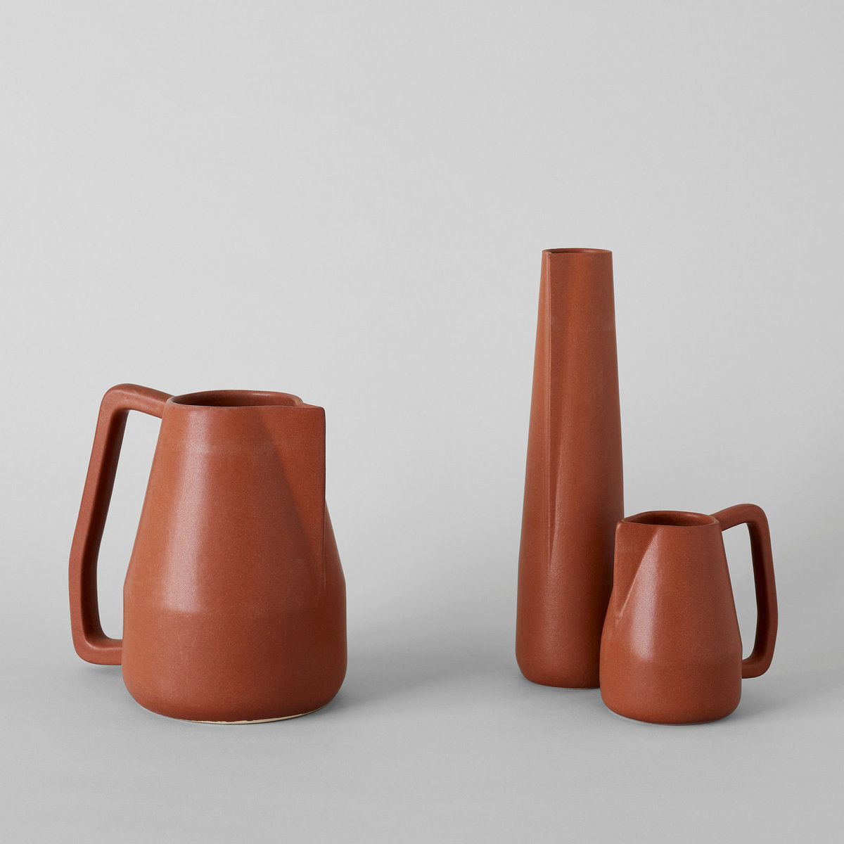
Alongside warm neutrals, deeper tones are making a refined return. Benjamin Moore's Color of the Year—a burnt umber with charcoal undertones—signals renewed interest in rich browns and darker wood finishes. This isn't the heavy, ornate darkness of previous decades. It's restrained, used to anchor a room rather than overwhelm it.
Dark wood is reappearing in furniture and shelving, often with visible grain and natural character rather than high-gloss polish. These pieces balance lighter palettes and give warm neutrals something to play against.
For smaller objects, this translates to vessels and planters in deeper earth tones. Think chocolate-glazed ceramics or blackened terracotta. Grouped on a light wood surface, they create visual weight without heaviness. Rooms feel settled and substantial rather than floating in pale neutrality.
Photo courtesy of Benjamin Moore


One of the more expressive directions for 2026 is color drenching—applying a single color across walls, trim, ceiling, and sometimes cabinetry to create an immersive space. Industry surveys show more than half of design experts identifying this as a leading color trend. It's showing up most often in smaller rooms where the effect can be concentrated, like a powder room or home office.
For those drawn to this approach but cautious about commitment, the principle scales down. Style a single shelf with objects in tonal variations of the same hue. Group dried flowers and grasses in shades that range from wheat to amber, or layer textiles in gradations from cream to taupe. The idea is unity through restraint—letting one color family do the work rather than introducing competing tones.
Color drenching works particularly well with the earthy greens that are gaining momentum. A room washed in sage, from wall to linen to ceramic, feels cohesive in a way that piecemeal decorating rarely achieves.

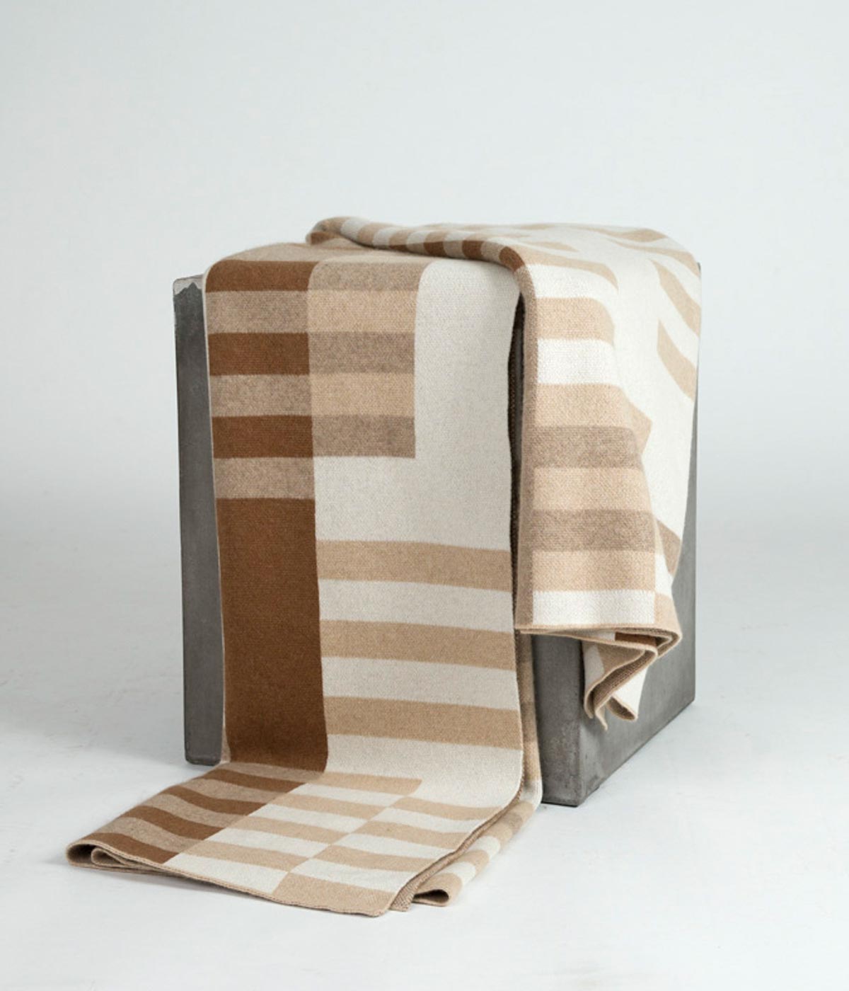
Design professionals are treating texture with new seriousness—not as an accent, but as a foundation. In spaces where the color palette stays restrained, interest comes from surface variation. Like the nub of a bouclé weave or the irregular grain of grasscloth, these details bring dimension without adding visual clutter.
Natural fibers do this work particularly well. Linen adds interest through hand-feel rather than pattern, and wool does the same in a different register. The key is layering for subtle variation rather than contrast. In cooler months, heavier fibers like cashmere or yak down add substance without bulk.
A simple test: if you can feel the difference between two objects with your eyes closed, they'll create interest together—think stonewashed linen against polished wood. The palette stays cohesive while the room gains depth.


There's a growing preference for objects that reveal how they were made—and where. For years, mass production prioritized uniformity, erasing the evidence of human hands. Now, buyers are seeking the opposite: ceramics shaped on a wheel with slight asymmetries that distinguish them from anything produced in a factory.
What makes this shift different in 2026 is the emphasis on traceability. Knowing that a planter was shaped from locally sourced clay using techniques passed down through generations, that context becomes part of the object itself. Artisan stamps and maker marks, once hidden on undersides, now signal provenance the way a signature confirms authorship.
This is where handcrafted objects prove their value most clearly. Mass-produced items tend to disappear into the background; they serve a function, but they don't reward attention. A hand-thrown ceramic pitcher, by contrast, becomes something you notice each time you reach for it—the weight in your hand, the way the glaze catches light. Over months and years, these small moments accumulate into a different relationship with your space.
There's no rush to fill a room. You might add one piece this season and another next year, each chosen because its origin story resonates. Choose fewer objects, each made well enough to be used daily. One versatile vase rather than six that never quite work. The result is a home that feels assembled with intention, where objects hold their meaning rather than fading into background noise.


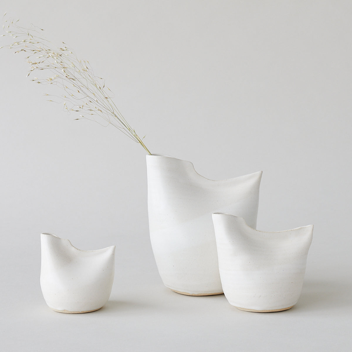


Rounded forms are re-emerging as a counterpoint to years of rigid geometry. Trends show curves among the leading design directions, with experts pointing to softer shapes across furniture and décor. This doesn't mean abandoning clean design—the best pieces maintain visual simplicity while softening a room's overall feel.
In planters, this often draws from traditional forms like the half-sphere shapes found in Tunisian pottery, where the curve of the vessel echoes the natural growth pattern of what it holds. The most successful groupings balance organic shape with restraint, giving each piece enough space to register on its own.
The same principle applies to tabletop objects. A rounded ceramic bowl on an entry table catches keys without sharp edges. The Bird Vase, with its sculptural, organic form, softens a shelf or mantel while holding a single stem or standing on its own.


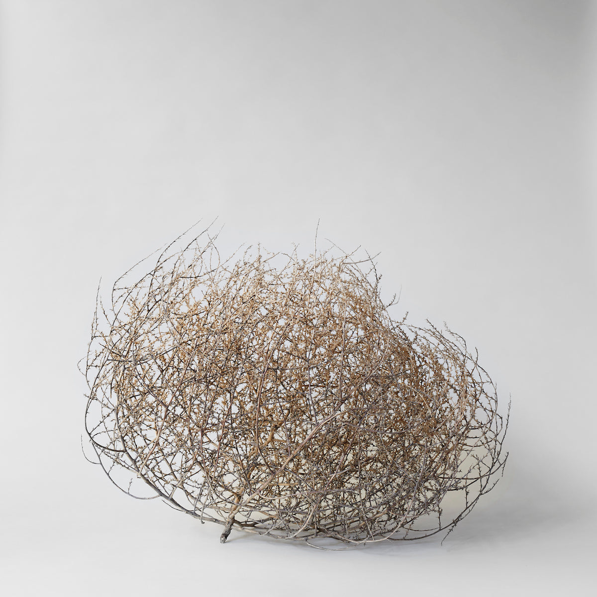


The connection between interiors and nature remains one of the defining directions for 2026. Industry surveys show a strong majority of design professionals naming "bringing nature into the home" as a leading priority. But maintaining fresh-cut flowers year-round carries both cost and environmental impact.
Dried botanicals offer an alternative that brings texture and visual interest without maintenance. A wheat wreath can move from fall harvest through the holidays without looking out of place. The most natural-looking arrangements combine dried, fresh, and preserved elements rather than relying on a single type. When paired thoughtfully, faux botanicals made from recycled or biodegradable materials can extend arrangements without the artificial look of older silk flowers. The goal isn't to replicate a fresh bouquet. It's to bring the same sense of life in a form that lasts.

The kitchen is no longer a space designed purely for efficiency. It's becoming a room that invites the same warmth as the rest of the home.
The all-white kitchen is losing its default status. Wood cabinetry, including white oak, maple, and finishes with visible grain, are edging back in, and with it, a look that feels more like a room than a laboratory. Objects on the counter no longer compete with sterile backdrops; they complement them.
Storage has shifted from an afterthought to a design element. Open shelving, in particular, demands thoughtfulness about what sits on display. A stoneware jar for sea salt isn't just a styling decision—it's a practical choice that happens to contribute to the room's character.

Design publications are calling it "curated maximalism," but the name undersells the point. It's not about accumulation for its own sake. It's about restraint in service of meaning—each object chosen because it belongs, not because it fills a space.
The difference between clutter and character comes down to intention. A terracotta planter you found three years ago. A textile inherited from family. These pieces tell a story that no single shopping trip could replicate.
The rooms that feel most alive in 2026 aren't the most decorated—they're the ones where every object has a reason to be there.

Your Shopping Cart is Empty
Browse our latest collection or check your saved favorites to add more items to your cart.


Manage your profile, track your orders, and enjoy a seamless shopping journey with us.